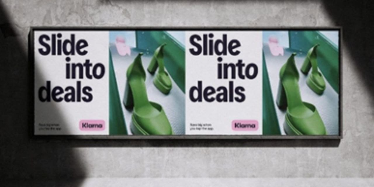
Klarna, the buy-now-pay-later giant, has revealed its updated brand messaging and design, crafted by its in-house team. The new look aims to enhance the shopping experience while maintaining the brand’s distinctive pink color. Klarna’s refreshed Curiously Bold brand identity is grounded in everyday life, striving to make money moments more enjoyable for everyone.
The new imagery focuses on fashion and lifestyle, adding a quirky edge while staying true to the essence of shopping and buying. This evolution of Klarna’s identity reflects its transformation into a comprehensive shopping ecosystem, beyond just a payment method. With a significant increase in BNPL usage, Klarna aims to cut through the noise and provide clarity in money matters.
While Klarna’s iconic pink color remains unchanged, the updated color palette complements it to create a vibrant visual identity. The company sees this as an evolution rather than a complete overhaul, aligning with its growth and development as a company.
Rebecca Jerndahl Tepavac, Klarna’s Head of Global Brand, emphasized the importance of adapting the brand identity to accommodate the company’s fast-paced growth and diverse market presence. James Cullen, Design Director, highlighted the creative concept of making the ordinary extraordinary, evident in the typography and art direction.
Flo Wales Bonner, Copy and Storytelling Director, emphasized the importance of a straightforward tone of voice in money matters, balanced with playful wit to elevate the experience. The brand’s refreshed identity aims to resonate with consumers globally, offering clarity, relevance, and a touch of optimism in every interaction.

