Colour combinations are a fundamental part of your image, you may find your design takes on a whole new dimension.
Trusty colour combinations can be found using the colour wheel. This isn’t just an art class gem from school – it remains an important tool for everyday design. To find complementary colours, simply look at the opposing side of the wheel.
Some of the classics :
- Yellow and purple
- Red and green
- Blue and yellow
- Orange and blue
1. Black and white
Simple, timeless, faultless.

2. Leaf green and Yellow
A classic choice for health brands, these shades suggest freshness.

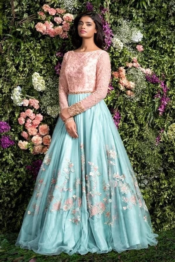
3. Baby pink and blue
Innocent, elegant, feminine, and perfect for brands that want a soft, dreamy appeal – like skincare and beauty businesses.

4. Cool greys and blues
Icy and calm – perfect for wintery designs.

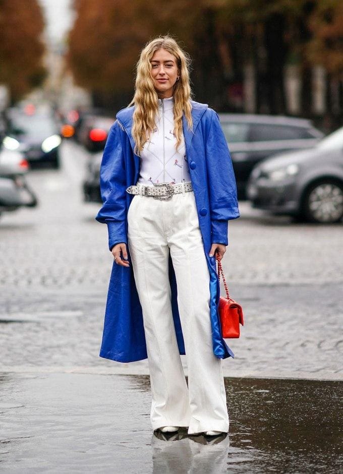
5. Pantone’s Classic Blue with white
A timeless way to evoke nautical charm and a calm, collected vibe.

6. Pink and grey
A mix of feminine pink and earthy, urban grey makes for a combination that’s both modern and timeless.

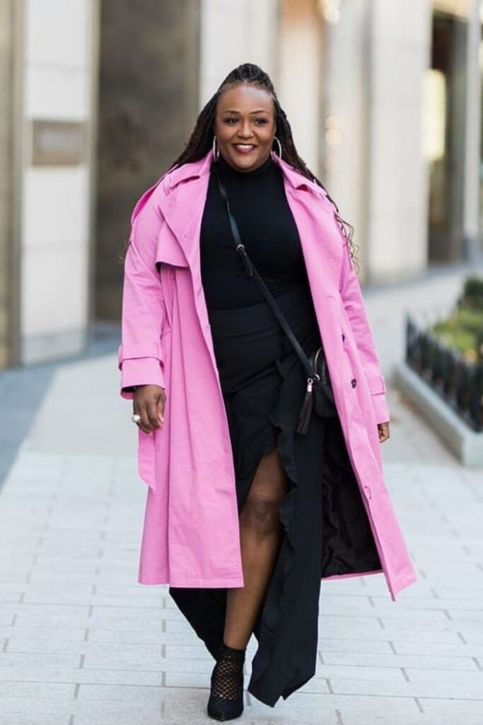
7. Pink and black
The bold urgency of this color combination will promise impactful branding. Add some white for an injection of freshness.

8. Purple and yellow
These colors are both bright and playful, but also have connotations of grandeur. The perfect combo for a brand that wants to appeal to a broad age range.

9. Orange and white
Bright, bold and simple, this color combo promises a professional brand that’s big on enjoyment.

10. Mint green and white
Clean and fresh. Green gives an earthy, uncomplicated tone, while white is simple and pure.


